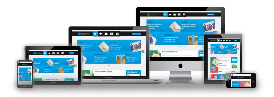
Responsive Layout
A responsive design automatically adapts itself to a particular viewing environment such as desktop, tablet or mobile, without the need for separate layouts for varying platforms. Responsive Layout design started becoming popular in late 2012 in preference to creating separate websites for mobile and tablet devices. We have now adopted this method of laying out content on our websites, where possible.